

Learning how to check the yield curve is one of the simplest ways for a trader to stop reading macro headlines blindly and start watching the real structure of the bond market.
Most new traders focus only on price charts. They look at S&P 500 (SPY), Nasdaq 100 (QQQ), gold (XAUUSD), crude oil (WTI), or Bitcoin (BTCUSD), but they ignore interest rates. That is a mistake.
The bond market is one of the deepest information sources in global finance. It reflects expectations about growth, inflation, Federal Reserve policy, credit conditions, and future economic stress. You do not need to become a bond trader. But if you trade equities, indices, ETFs, currencies, commodities, or futures, you should understand what the yield curve is saying.
The good NEWS: you can check it for free on TradingView.
What Is the Yield Curve?
The yield curve compares interest rates across different maturities of government bonds.
In simple terms, it shows the difference between short-term rates and long-term rates.
One of the most watched versions is the 10Y-2Y spread. This compares the U.S. 10 Year Government Bond Yield (US10Y) against the U.S. 2 Year Government Bond Yield (US02Y).
The formula is simple:
US10Y - US02Y
If the U.S. 10 Year Government Bond Yield (US10Y) is higher than the U.S. 2 Year Government Bond Yield (US02Y), the spread is positive. That is usually considered a more normal curve.
If the U.S. 2 Year Government Bond Yield (US02Y) is higher than the U.S. 10 Year Government Bond Yield (US10Y), the spread becomes negative. That is called an inverted yield curve.
An inversion does not mean the market crashes tomorrow. That is amateur thinking. But it does mean the bond market is pricing stress, tighter policy, or weaker future growth expectations.
Why the Yield Curve Matters for Traders
The yield curve matters because it helps traders understand the macro environment.
When the curve is steepening, it can suggest improving growth expectations, changing inflation expectations, or a shift in monetary policy expectations. When the curve is flattening, it may suggest that short-term rates are rising faster than long-term rates, often because the market expects tighter central bank policy.
When the curve inverts, the message becomes more serious. It often means short-term policy pressure is high while long-term growth expectations are weaker.
For traders, this matters because different assets behave differently in different macro regimes.
Growth stocks, such as many companies inside Technology Select Sector SPDR Fund (XLK), may react differently to rising yields than defensive sectors like Utilities Select Sector SPDR Fund (XLU) or Consumer Staples Select Sector SPDR Fund (XLP). Financial Select Sector SPDR Fund (XLF) may also react strongly to interest rate structure because banks care about lending margins, credit conditions, and funding pressure.
This is why the Valeron Markets Macro Engine Click Here to Access uses macro data as part of the market framework. The goal is not to predict every candle. The goal is to understand the environment before taking risk.
How to Check the Yield Curve on TradingView
TradingView allows you to create custom spread charts using symbol formulas. That means you can subtract one yield from another and create your own 10Y-2Y yield curve chart.
You can do this for free.
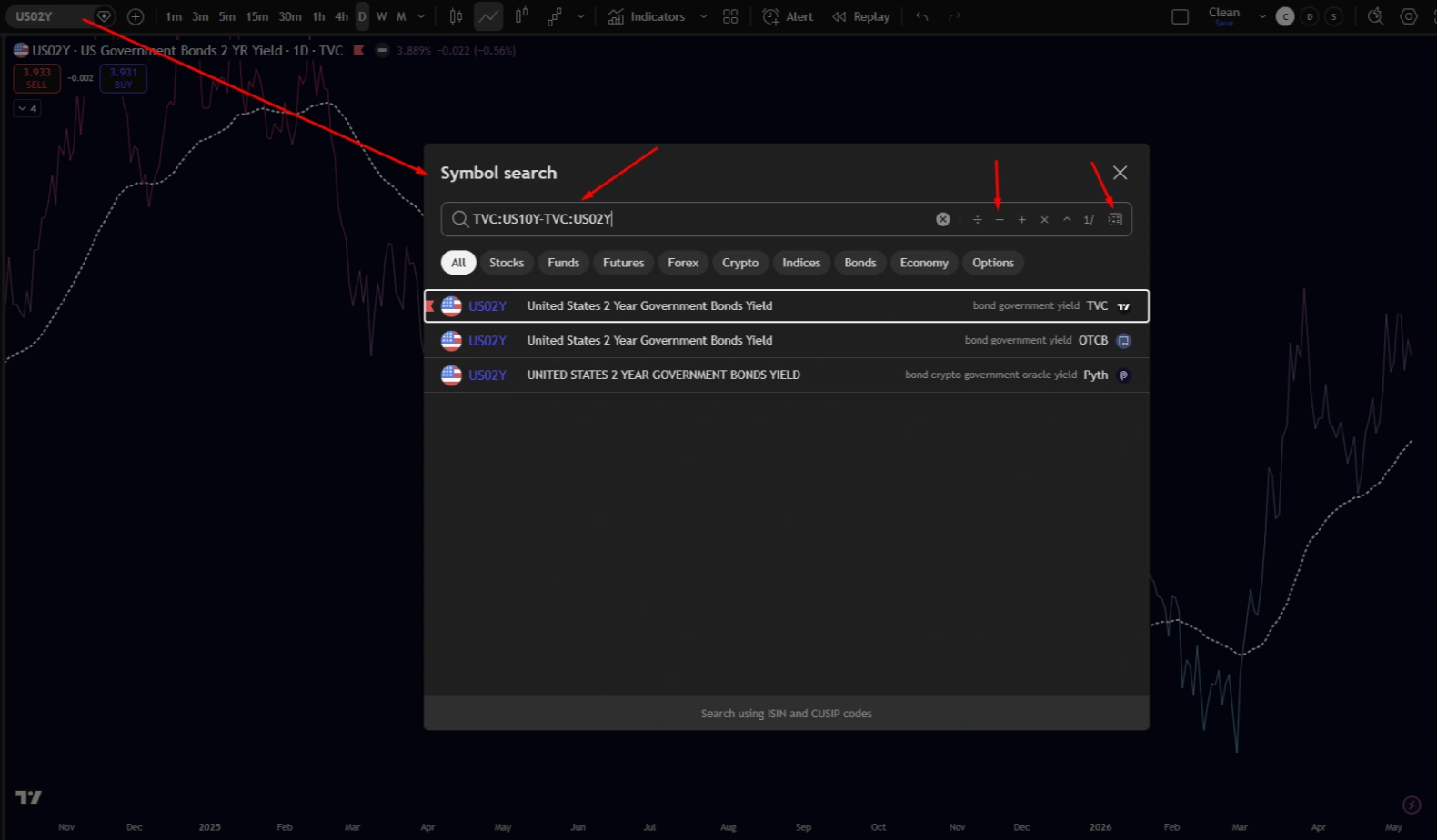
Step 1: Open TradingView and Search for the 10Y-2Y Spread
Open TradingView and click the symbol search box in the top-left corner.
Then type this formula:
TVC:US10Y-TVC:US02Y
This tells TradingView to take the U.S. 10 Year Government Bond Yield (US10Y) from the TVC data source and subtract the U.S. 2 Year Government Bond Yield (US02Y).
In the screenshot, you can see the formula being typed directly into the TradingView symbol search field. This is the core step. You are not searching for a normal ticker. You are creating a spread.
Select the result that represents the custom spread.
Step 2: Set the Chart to Daily and Use a Line Chart
After loading the spread, set the timeframe to Daily.
The yield curve is macro information. You do not need to watch it on a 1-minute chart like a scalper. Daily is cleaner. Weekly can also be useful for a broader view, but Daily gives a good balance between structure and responsiveness.
Then change the chart type to a line chart.
A line chart is better here because you are not trading candles on the yield curve. You are reading direction, slope, turning points, and regime changes. Candles can add visual noise. A clean line chart makes the macro signal easier to interpret.
Step 3: Add a Moving Average
Now add a moving average to the 10Y-2Y spread chart.
You can use a simple moving average or an exponential moving average. The screenshot shows a moving average smoothing the spread, which helps identify whether the yield curve is trending higher, trending lower, flattening, or trying to reverse.
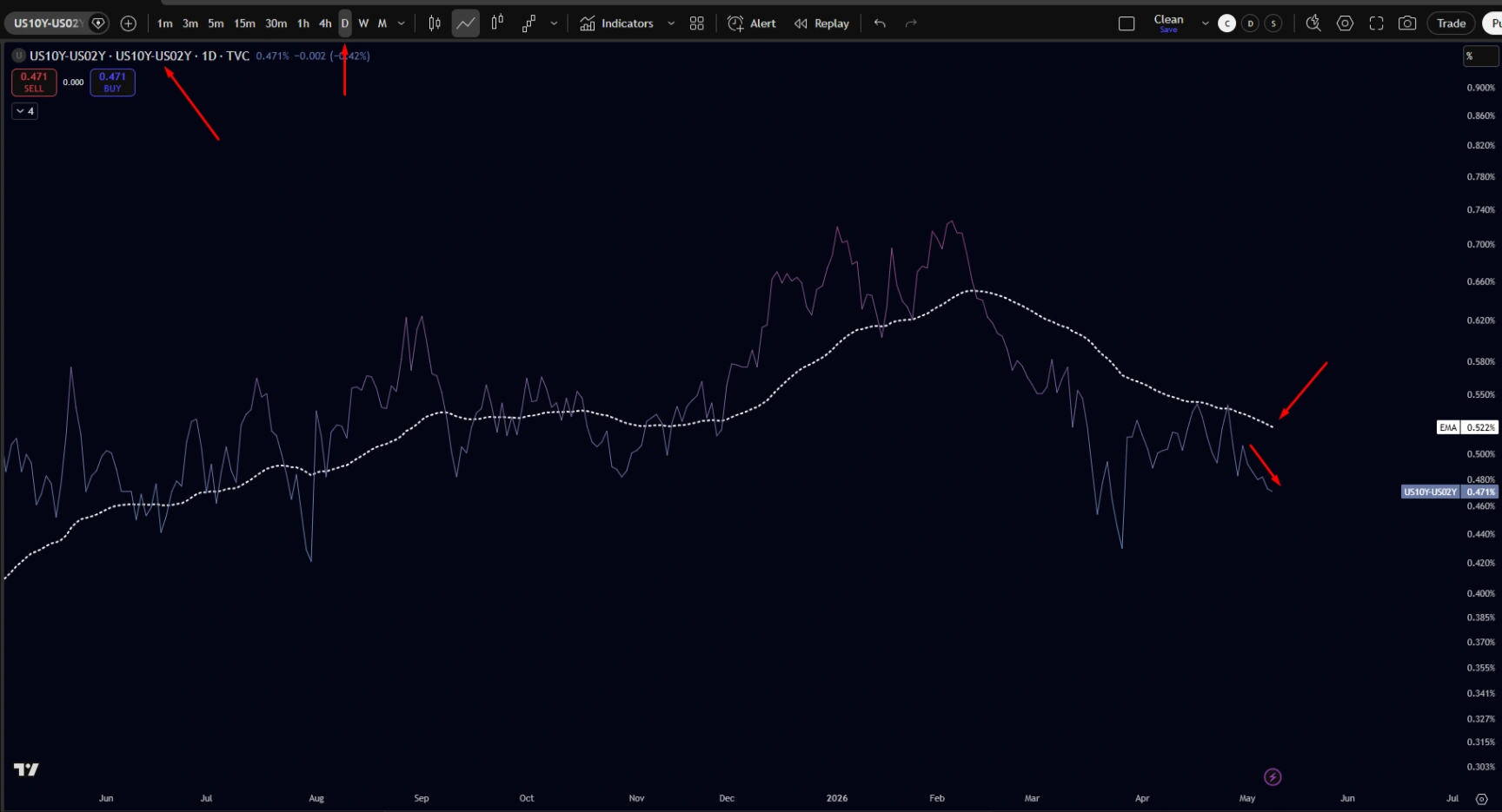
There is no magic period. A 50-day moving average is useful for intermediate macro direction. A 100-day or 200-day moving average can be better for slower macro regimes. The point is not to find a perfect setting. The point is to reduce noise and make the curve easier to read.
How to Interpret the 10Y-2Y Spread
Once your chart is ready, focus on four conditions.
1. Positive and Rising
If the 10Y-2Y spread is positive and rising, the curve is steepening.
This can suggest that long-term yields are rising relative to short-term yields. Depending on the context, this may reflect stronger growth expectations, inflation expectations, or changing policy expectations.
For traders, this can support a more risk-aware but opportunity-driven environment, especially if equities, credit, and sector rotation confirm.
2. Positive but Falling
If the spread is positive but falling, the curve is flattening.
This often means short-term yields are catching up to long-term yields. It can happen when markets expect tighter central bank policy or slower future growth.
This is a warning to reduce arrogance. It does not mean sell everything. It means pay attention.
3. Negative and Falling
If the spread goes below zero and keeps falling, the curve is inverted and deepening.
This is usually a serious macro warning. It can signal that monetary policy is tight and the market expects weaker growth ahead.
For traders, this is not an automatic short signal. But it should affect risk appetite, position sizing, and sector selection.
4. Negative but Rising
If the spread is still negative but rising, the curve is beginning to steepen from inversion.
This phase can be important. Sometimes the market starts pricing future rate cuts, weaker growth, or a policy shift. This is where many traders make mistakes because they assume steepening is always bullish. It is not that simple.
A yield curve steepening because growth is improving is different from a yield curve steepening because recession risk is rising and short-term yields are falling.
Context matters. Always check credit, volatility, sector rotation, and price action.
The Yield Curve Is Not a Buy or Sell Signal
The yield curve is a macro filter. It is not a trading signal by itself.
Do not buy S&P 500 (SPY) just because the curve steepens. Do not short Nasdaq 100 (QQQ) just because the curve inverts.
That is lazy.
Use the yield curve to understand the environment. Then combine it with technical analysis, sector strength, volume, and risk controls.
For example, if the yield curve is warning of stress, High Yield Corporate Bond ETF (HYG) is weakening against Investment Grade Corporate Bond ETF (LQD), and defensive sectors are leading, you should not trade like it is a clean risk-on market.
If the yield curve improves, credit stabilizes, and Technology Select Sector SPDR Fund (XLK) or Financial Select Sector SPDR Fund (XLF) starts outperforming S&P 500 (SPY), then the market may be showing a different message.
This is why a dashboard like the Valeron Markets Macro Engine Click Here to Access is useful. It helps organize these signals into a cleaner decision process.
Execution Still Matters
Macro analysis gives you context. Execution decides your result.
If your broker has wide spreads, unstable fills, or poor execution quality, your strategy becomes less efficient. This is why Tickmill matters. Click here and open your free account. A serious trader should care about spreads, slippage, available instruments, commissions, and platform reliability.
Structured capital also has value for disciplined traders. TheTradingPit can help traders operate inside clear risk limits, drawdown rules, and performance pressure. Click Here and Start Trading Now. That structure is not for gamblers. It is for traders who can follow rules.
Systematic execution can also outperform emotional manual trading in many cases. Bots and rule-based systems do not panic, revenge trade, or hesitate. The trader still needs a real strategy, but automation can remove a lot of human weakness.
For traders who want a broader strategy playbook, The Best 100 Strategies is a useful next step. Click here to download yours. It helps traders study multiple setups instead of depending on one fragile idea.
Final Word: Watch the Bond Market
The yield curve will not tell you everything. Nothing does.
But if you ignore it, you are trading without one of the most important macro instruments on the board.
Learn how to check the yield curve. Watch the U.S. 10 Year Government Bond Yield (US10Y) minus the U.S. 2 Year Government Bond Yield (US02Y). Use a line chart. Add a moving average. Read the slope. Respect the message.
Do not trade headlines. Do not trade opinions. Build a process.
Structure. Discipline. Edge.
Macro data source: FRED