

Learning how to read the yield curve is one of the fastest ways to stop trading like a headline addict and start thinking like a market professional.
Most retail traders live on price charts only. They watch S&P 500 ETF (SPY), Nasdaq 100 ETF (QQQ), gold (XAUUSD), crude oil (WTI), or Bitcoin (BTCUSD), but they ignore the bond market. That is a serious blind spot.
The bond market is not just another market. It is where interest rates, growth expectations, inflation pressure, policy expectations, liquidity, and risk appetite collide. If you trade stocks, ETFs, indices, currencies, commodities, or futures, the yield curve should be part of your macro process.
You do not need to become a bond specialist. However, you do need to understand what the curve is telling you.
What the Yield Curve Shows
The yield curve compares interest rates across different government bond maturities.
A normal curve usually means long-term yields are higher than short-term yields. That makes sense because investors generally demand more compensation to lend money for longer periods.
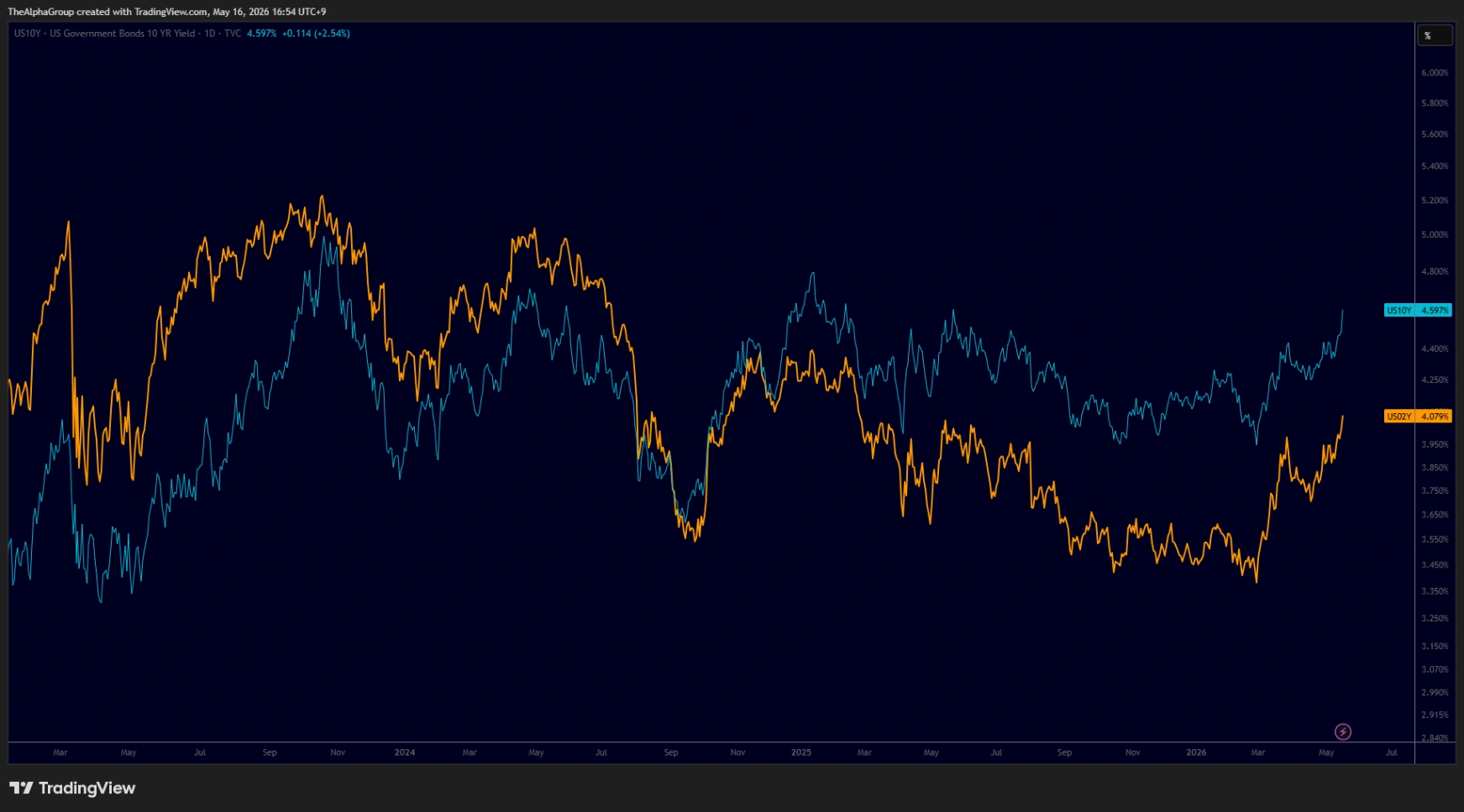
One of the most watched spreads is the difference between the U.S. 10 Year Government Bond Yield (US10Y) and the U.S. 2 Year Government Bond Yield (US02Y).
The formula is simple:
US10Y - US02Y
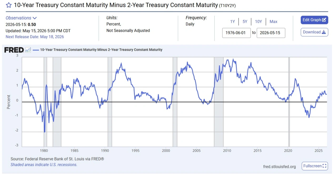
FRED tracks this as the 10-Year Treasury Constant Maturity Minus 2-Year Treasury Constant Maturity, also known as T10Y2Y. The series measures the spread between 10-year and 2-year Treasury constant maturity yields.
If the spread is positive, the 10-year yield is above the 2-year yield. If the spread is negative, the 2-year yield is above the 10-year yield. That negative condition is called an inversion.
Why the Curve Matters
The yield curve matters because it reflects pressure inside the monetary system.
When short-term yields rise aggressively, the market may be pricing tight monetary policy. When long-term yields fall or stay weak, the market may be pricing slower future growth. Therefore, when the 2-year yield rises above the 10-year yield, the message is not random. It usually means the market sees stress, tight policy, or weaker future conditions.
FRED notes that positive values may imply future growth, while negative values may imply economic downturns. That does not mean an inversion predicts the exact timing of a recession or market crash. It means the bond market is flashing a macro warning.
That distinction is important.
A professional does not say, “The curve inverted, so I must short everything today.”
That is lazy.
A professional says, “The curve is warning me that the environment is changing. I need to reduce arrogance, check credit, monitor sector rotation, and adjust risk.”
The Four Conditions to Watch
You do not need to overcomplicate the yield curve. Start with four basic conditions.
1. Positive and Rising
A positive and rising 10Y-2Y spread means the curve is steepening.
This can happen when long-term yields rise faster than short-term yields, or when short-term yields fall faster than long-term yields. The interpretation depends on the broader environment.
If growth expectations are improving, credit is healthy, and risk assets are strong, steepening can support a more constructive outlook.
However, if steepening happens because short-term yields are collapsing, it may signal that markets expect rate cuts due to economic stress. Context matters.
2. Positive but Falling
A positive but falling spread means the curve is flattening.
This often appears when short-term yields rise faster than long-term yields. In many cases, that reflects tighter policy expectations or concerns that future growth may weaken.
For traders, this is a warning phase. It does not automatically mean risk-off, but it tells you the macro environment is becoming less forgiving.
3. Negative and Falling
A negative and falling spread means the curve is inverted and the inversion is deepening.
This is the phase that gets attention because it shows short-term yields above long-term yields. In plain English, the market is saying that short-term policy pressure is high while long-term growth expectations are weaker.
During this phase, traders should be careful with aggressive risk-taking, especially if credit conditions are deteriorating and defensive sectors are leading.
4. Negative but Rising
A negative but rising spread means the curve is still inverted, but it is steepening back toward zero.
Retail traders often think this is automatically bullish. That is not always true.
Sometimes the curve steepens because the market expects the Federal Reserve to cut rates due to future weakness. In that case, the curve may improve while the economy is actually under pressure.
Therefore, do not read the curve in isolation.
How to Check It on TradingView
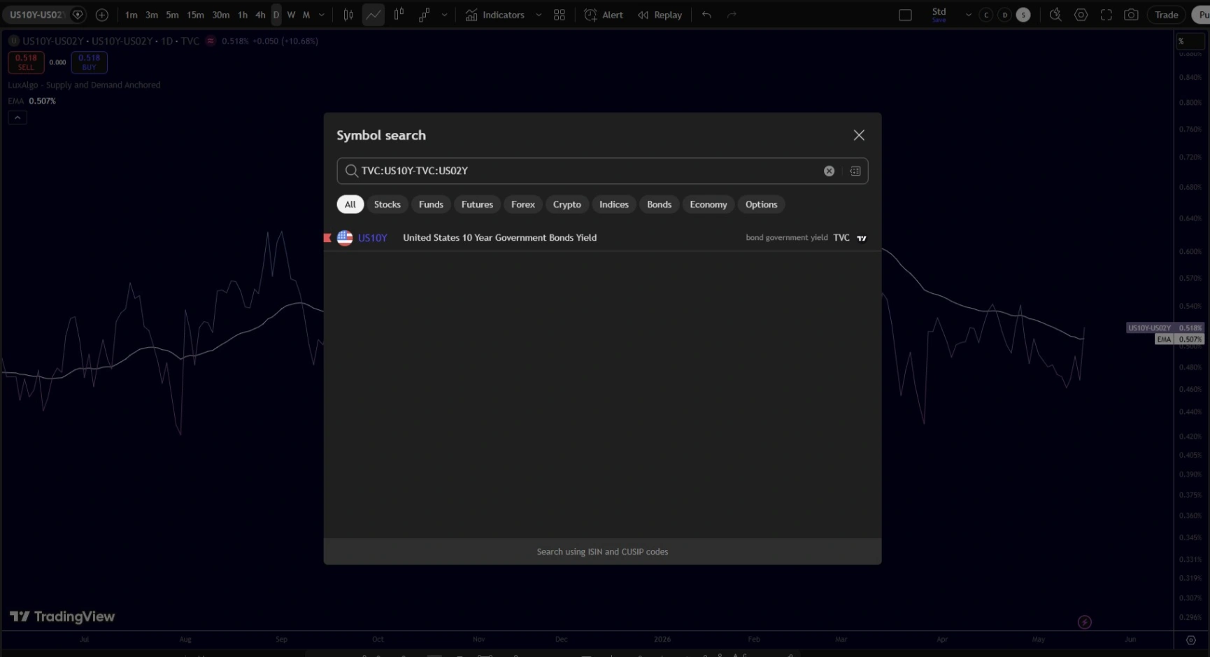
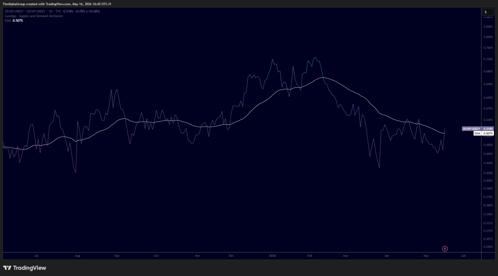
You can check the 10Y-2Y spread for free on TradingView.
Use this formula in the symbol search box:
TVC:US10Y-TVC:US02Y
Then set the chart to Daily or Weekly and use a line chart. After that, add a moving average to smooth the signal.
A 50-day moving average can help with intermediate direction. A 100-day or 200-day moving average can help with slower macro regimes. The point is not to find a magic setting. The point is to reduce noise and read the slope clearly.
TradingView also provides FRED economic data, including the 10-Year Treasury Constant Maturity Minus 2-Year Treasury Constant Maturity series from the Federal Reserve Bank of St. Louis.
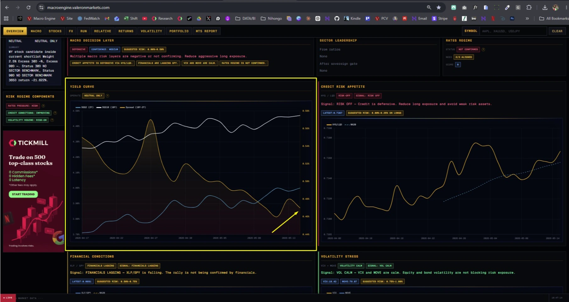
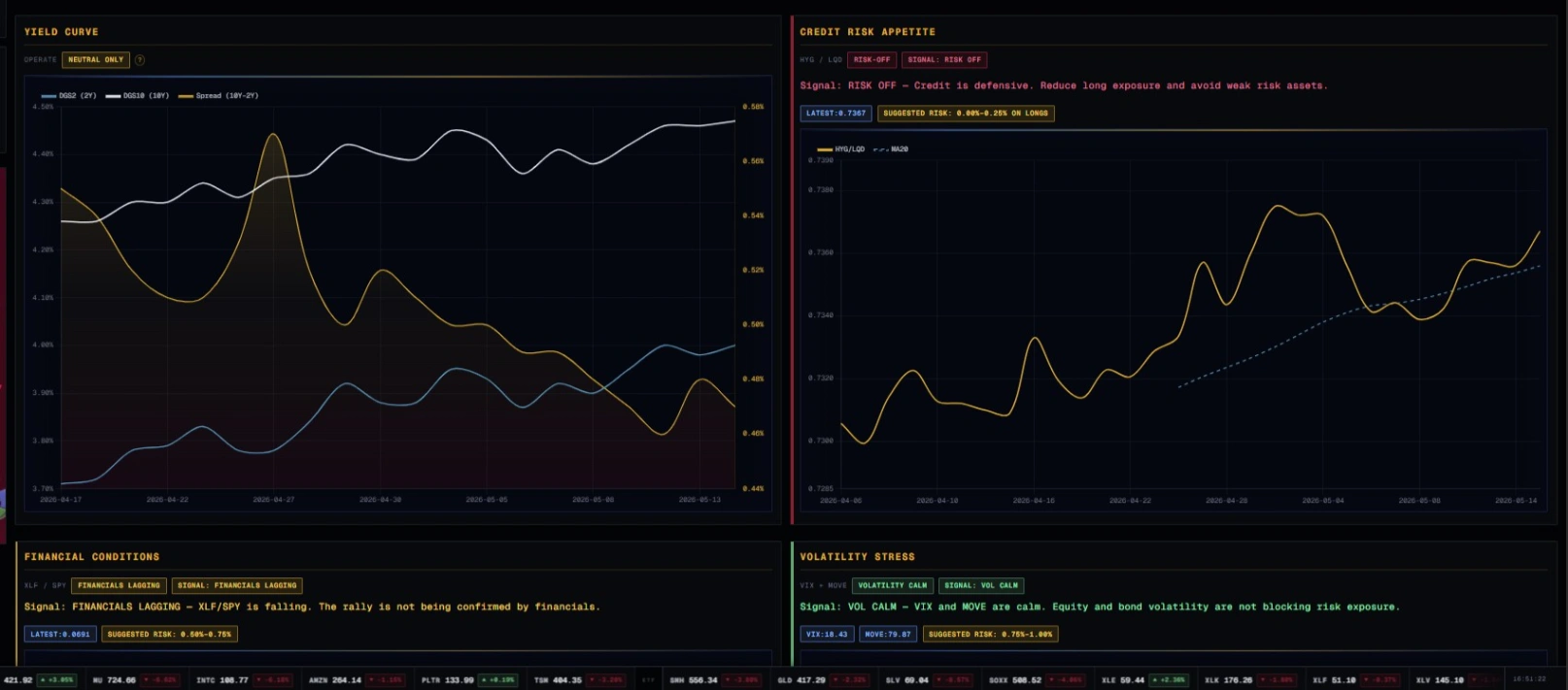
How to Use the Valeron Macro Dashboard
The Valeron Markets Macro Dashboard Click Here to Access helps traders avoid checking macro data manually across too many sources. It is updated a few times per week and is designed to organize market conditions into a cleaner decision framework.
The yield curve is only one part of the process.
A professional trader also checks:
Sector rotation.
Credit conditions.
Volatility pressure.
Dollar strength.
Relative performance against S&P 500 ETF (SPY).
Defensive versus growth leadership.
Risk-on versus risk-off behavior.
This is where a dashboard becomes useful. The curve may warn of stress, but sector rotation may show where capital is hiding. Credit may confirm whether risk appetite is healthy. Volatility may show whether the market is stable or unstable.
One signal is useful. A cluster of signals is stronger.
How Traders Should Apply the Signal
The yield curve is not a buy or sell signal.
It is a macro filter.
If the curve is flattening or inverted, you may reduce position size, demand cleaner setups, avoid weak sectors, or wait for stronger confirmation. If the curve is steepening in a healthy environment, you may allow more risk, especially if sector strength and technical momentum confirm.
For example, if the curve is improving, credit is stable, and Technology Select Sector SPDR Fund (XLK) is outperforming S&P 500 ETF (SPY), growth trades may deserve attention.
However, if the curve is inverted, High Yield Corporate Bond ETF (HYG) is weakening against Investment Grade Corporate Bond ETF (LQD), and Utilities Select Sector SPDR Fund (XLU) is leading, the message is different. That is not the time to trade like a hero.
Execution Still Matters
Macro analysis helps you read the environment. Execution decides whether the process survives contact with the market.
Spreads, slippage, commissions, platform stability, and order quality matter. This is why Tickmill matters. Click here and open your free account. A serious trader should choose a broker based on execution quality, costs, available instruments, and reliability, not marketing noise.
Structured capital can also help disciplined traders. TheTradingPit gives traders a rules-based environment with drawdown limits, performance targets, and risk control pressure. Click Here and Start Trading Now. That structure is not for gamblers. It is for traders who can follow a process.
Systematic execution also deserves respect. Bots and rule-based models can help remove emotional mistakes, especially when they are built around macro filters, technical triggers, and defined risk.
For traders who want a broader tactical playbook, The Best 100 Strategies can help expand the number of setups and execution frameworks they understand. Click here to download yours.
Final Word: Respect the Bond Market
The yield curve will not tell you everything. Nothing does.
However, it gives you one of the clearest windows into interest rate pressure, growth expectations, and macro stress. If you ignore it, you are trading with less information than serious market participants use every week.
Read the curve. Watch the slope. Respect inversion. Study steepening carefully. Then combine it with credit, volatility, sector rotation, and technical analysis.
Do not trade headlines. Do not trade opinions. Build a process.
Structure. Discipline. Edge.
Macro data source: FRED